
These posters are just mock posters for a child's story hour at a library.
These posters are completely fictional, and were simply made as an example of a project that was created for a specific audience. |
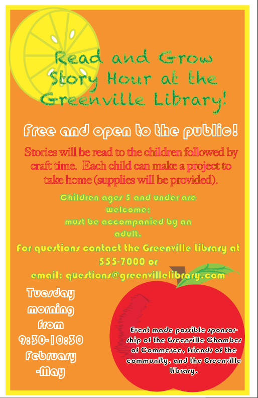
Both of these posters are 11x17 and were created in Adobe Illustrator.
The focus group for these posters were children and their parents. The bright colors and swirly attractive pattern is meant to catch a child's eye. (poster on the left) The warm inviting colors and 'organic' images were chosen and created to catch the parent's eye.(poster on the right). |
How to create an effective design.
When creating a poster you want it to draw in your desired audience. In order to effectively complete this task you need to think of what it is you are trying to present, and think of what your desired audience would like to see.
- The first thing you want to ask yourself is "If i were (insert focus group) what would be appealing to me"?
- Think of what colors and images may draw them in. You also want to put your typeface, or font, into consideration.
- Always prioritize your text The most important information (Title, names, dates, contact information, ect.) should always be easily visible and in an appropriate placement.
Color choice.
When designing a customer design, or project intended for someone other than yourself, try to stay away from just choosing colors YOU enjoy,
The best way to choose colors for a project is to choose from one of the following options:
The best way to choose colors for a project is to choose from one of the following options:
- Choose seasonal colors. Picking a seasonal color will match your design to it's surroundings.
- Choose colors to match your designs theme. Picking 'themed' colors is more generic, but it will match up with the content of your design.
- Choose all one color. Using multiple shades of all one color helps the design flow together.
- Choose complementary colors. Complementary colors are opposite on the color wheel, and they always work together.
- Request a color scheme from your client.
- Choose neutral colors. Neutral colors will go with basically everything. Use neutrals mainly for more serious or 'business' type layouts. Neutral colors tend to be bland, therefore they are not always eye catching.
Type Choice.
Type choice is extremely important!! You always want everything to be easily visible to anyone who may want to read your poster. Try to stay away from small, compacted, or scripted typefaces.
Type size is also important. You always want correct placement of your text. You wouldn't want the Title to be smaller than the rest of the information. Always place by importance, with the more important text larger than the lesser important text!
Type size is also important. You always want correct placement of your text. You wouldn't want the Title to be smaller than the rest of the information. Always place by importance, with the more important text larger than the lesser important text!
- You can change up your font choice, but try to use no more than 3 different fonts all on one design. I would stick with maybe two. Titles and main information are often different fonts, as well as credit or sponsorship(as seen in the posters above).
- Always make sure, if you are going to use multiple typefaces, that they fit together, or follow the same theme.
- Using Novelty typefaces are always fun, but try not to use too many, and always make sure they are readable.
- Always make sure you choose an appropriate color that will stand out on top of the background.
Ideas.
NEVER copy someone else's idea. You can always look for inspiration, but make sure your design is unique. You never want to give someone credit for what you have designed, and most people won't want a copy. Be creative.
